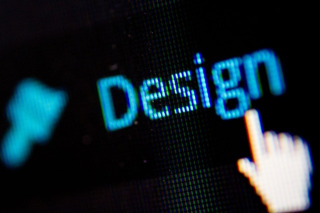
A Beginners Guide for WordPress Web Design
WordPress powers around 34% of the internet. Not only is WordPress powering blogs, but many eCommerce sites are using WordPress as well.
If you’re thinking about starting your own website, you might be considering WordPress but are wondering how hard WordPress web design is. If you aren’t very technically inclined, it can seem daunting to design your own website but we can help. Continue reading this article and learn some simple tips for designing your website on WordPress.
Choose a Theme That Will Work for You
Depending on how good you are with technical matters, you might need to choose a pretty simple theme. WordPress themes are what make your website show up the way they do online. WordPress themes allow you to have certain functions and ways to showcase your content without coding it yourself.
There are literally thousands of themes available online. You will find some themes are paid themes and some are free. You’ll find themes that require a yearly subscription and other themes that you can buy with a one-time investment.
Depending on the type of site you want to make, you’ll find that certain themes work better for you than others. If you’re building a magazine-style website, there are themes that are specifically for this style of website. If you want to build a photography website, you’ll be able to find themes optimized for sharing your photography.
Keep a Tidy Sidebar
The sidebar of your WordPress site is seen on every page on most designs. The sidebar isn’t where you should put everything that you can think of. Recent posts, ads, promotions, about sections and many other sections could confuse or distract your readers.
Be purposeful when you put things into your sidebar. Whether you’re using managed hosting or cpanel hosting, you access your sidebar settings the same way. Go into your dashboard, go to appearance and click on widgets. When you are in the widgets section, you’ll be able to easily change what’s in your sidebar.
Make It Easy to Navigate Your Website
Nothing is more frustrating than going to a website where you can’t find what you’re looking for. Your website navigation should make sense when people come to find information.
Group related topics, create categories, and structure your menu section in a way where people can see your system and thought process. If you have a finance section on your website, you might add subsections like Debt Resolution, Savings, Investing, and anything else related that can be considered a subtopic.
User experience is an important part of web design. Focus on planning out your website navigation before you even create content and it will work much better for you.
Choose a Clean Permalink Structure
Permalink structure is your website link structure. For instance, if your website is yourwebsite.com, your permalink might be yourwebsite.com/post1 or yourwebsite.com/posttitle. You can choose what your permalink structure is in the settings section near the bottom of the dashboard sidebar.
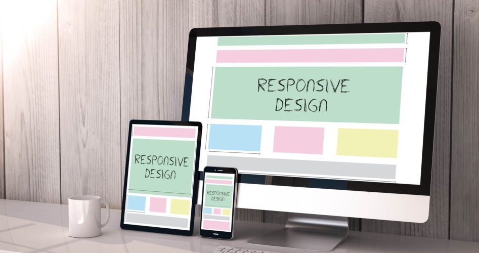
Use Images to Drive Your Point Home
Images help your readers stay engaged. We all remember loving to read picture books and getting excited to see what was on the next page. Now as adults, images still help drive points home so we are able to understand the information.
Not only do images make your page look better and engage your readers but they can also help with search engine optimization (SEO). You have the ability to put “alt text” with the keyword when you upload it to your WordPress page or post for better SEO results.
You can use stock images or you can take your own images and use them on your site. Stock images are inexpensive these days or you can even find some online for free.
Select an Appealing Font
If you don’t want to look like every other website online and use the Arial font, you might want to look into other fonts. You are going to find that there are a lot of options available but you need to find fonts that go along with your brand’s look.
You don’t necessarily have to use a different font throughout your website but you might want to use a fancy font on your headers. While you want your website to be attractive to your visitors, you don’t want to visually overload them or make your website difficult for them to read.
There are even places where you can create your own font, download it and use it on your site to make it uniquely yours. This is a little bit of a pro-tip but it might be something you want to consider later down the road when you’re working on your branding.
Don’t Forget the Footer
While the footer might seem a little boring, it is prime real estate. People scroll to the bottom of your page to get an idea of how long the content is. Make sure you have important information there so they can see it and possibly decide to stay on your page longer.
Depending on the theme you choose for your website, you may even be able to pull images from your Instagram feed, show excerpts from your About page and more.
WordPress Web Design for the Win
Now that you know more about WordPress web design, a whole new world is open to you. Why not keep learning? We have many other articles on our site that can open up more worlds and exciting opportunities.
Browse our website, find your favorite section, drop a bookmark and come back soon for more great reads.


